About
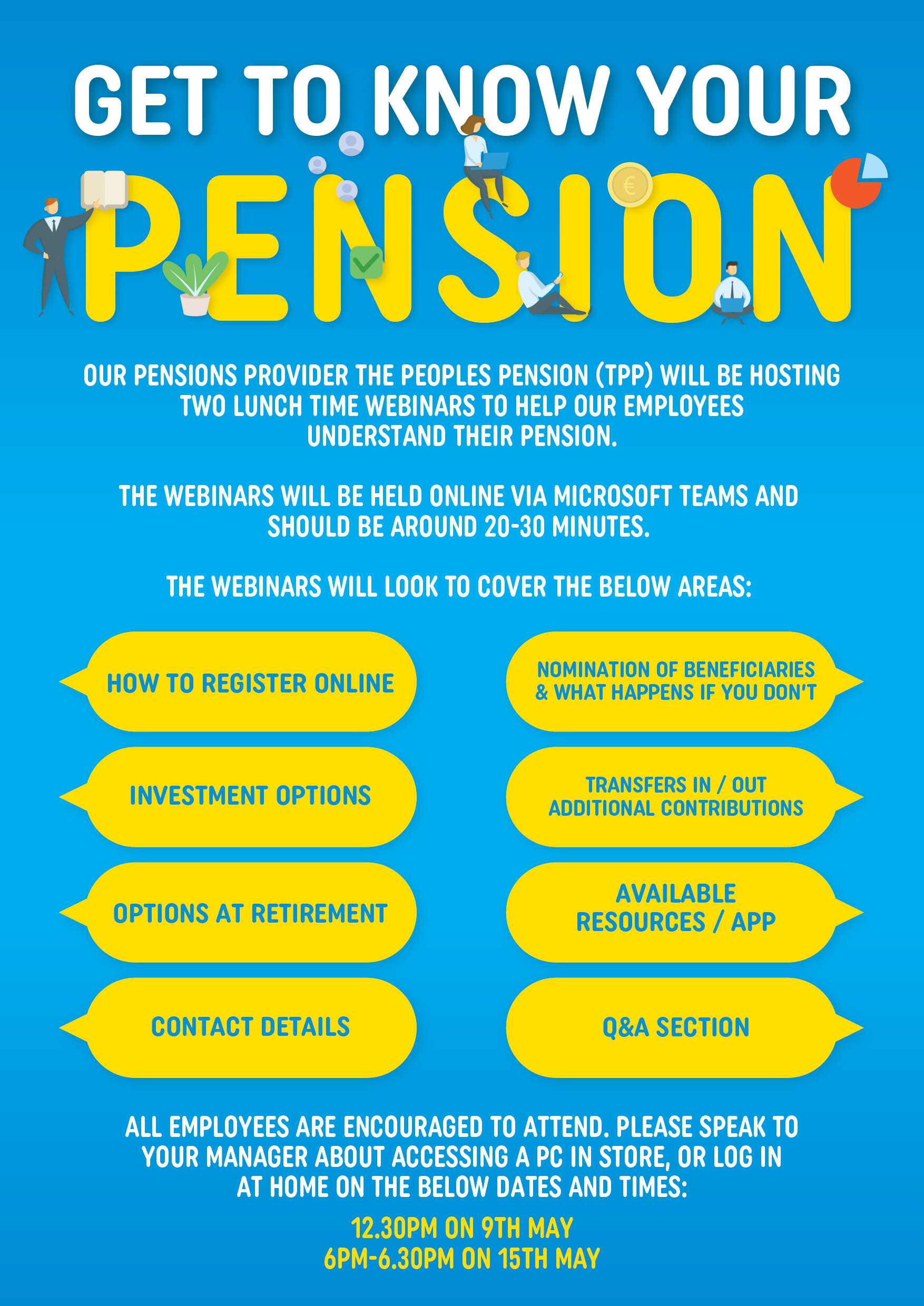
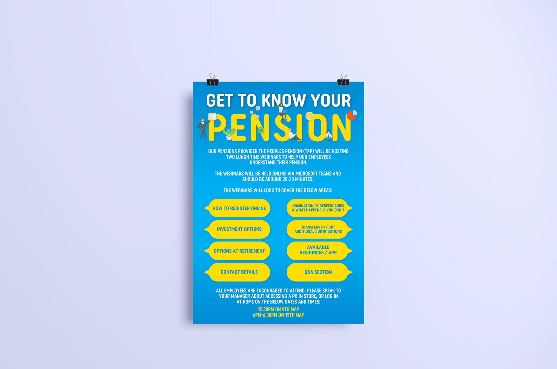
For this "GET TO KNOW YOUR PENSION" poster, the main challenge was to break up the text in a way that makes it less jarring on an A3 poster. Adding visuals like holding shapes for the segments gives the viewer the chance to get an idea of the content at a glimpse.
I used Smyths' corporate colours, yellow and blue, and went with a simple blue gradient for the background to not distract from the text but also make it dynamic.
The bright yellow was perfect to highlight the most important information.
The bright yellow was perfect to highlight the most important information.
The little corporate vector graphics both capture the subject matter as well as the concept of a HR organised webinar.